
Key Takeaways
Clean design is about clarity, not aesthetics. A website should guide decisions, not just look minimal.
Most websites become messy over time. Layers of content, features, and quick fixes slowly create friction.
Every element must have a purpose. If it does not support the main goal of the page, it should not be there.
Hierarchy matters more than visuals. Users should immediately understand what is most important.
Whitespace is not decoration. It creates structure and improves readability when used intentionally.
Consistency builds trust. Spacing, typography, and layout should feel predictable across the site.
Clean design reduces cognitive load. The less users need to think, the faster they act.
Minimal does not mean empty. Removing too much can hurt clarity just as much as adding too much.
Clean design improves SEO and conversions. Better structure and faster interaction benefit both users and search engines.
The fastest way to improve your site is to remove something. Start by cutting one unnecessary section and build from there.
What Is Clean Website Design?
Clean website design is a design approach that removes unnecessary elements so users can focus on the content, action, and message without distraction.
It is not about having fewer elements; it is about having only the right ones. A clean website feels easy because every part has a purpose.
A simple way to define it:
| Messy Design | Clean Design |
|---|---|
| Too many choices | Clear next step |
| Competing elements | Visual hierarchy |
| Visual noise | Focused layout |
| Inconsistent styles | Cohesive system |
8 Core Principles of Clean Website Design
Clean design works when structure, clarity, and intent align. These principles are what actually create that feeling.
1. Clear visual hierarchy
Users should immediately see what matters first, second, and third.
2. Purpose-driven elements
Every section, image, and button should have a role. If it does not support the goal, it should not be there.
3. Consistent spacing and layout
Spacing creates rhythm. Inconsistent spacing creates tension and confusion.
4. Limited colour palette
Too many colours compete for attention. A focused palette guides it.
5. Readable typography
Clean design is often won or lost in text. Line height, font size, and contrast matter more than font choice.
6. Strong alignment
Elements should feel anchored. Misalignment makes even simple designs feel chaotic.
7. Content prioritisation
Not everything deserves equal attention. Highlight what drives action.
8. Reduced cognitive load
The user should not need to think about how to use the site.
A quick summary:
| Principle | What it solves |
|---|---|
| Hierarchy | Decision clarity |
| Spacing | Visual breathing room |
| Consistency | Trust and predictability |
| Simplicity | Faster interaction |
Clean Website Design Examples
The easiest way to understand clean design is to see it applied in different contexts.
Clean Business Website Design Examples
Stripe

Stripe uses clean design through strong hierarchy and spacing. The page feels simple even though it contains a lot of information.
Superhuman
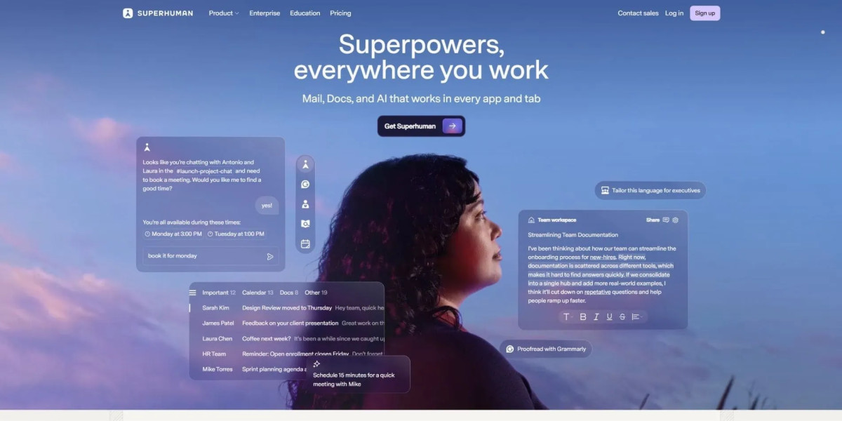
Superhuman removes distractions completely. Every section pushes the same message forward.
Clean Corporate Website Design Examples
Apple
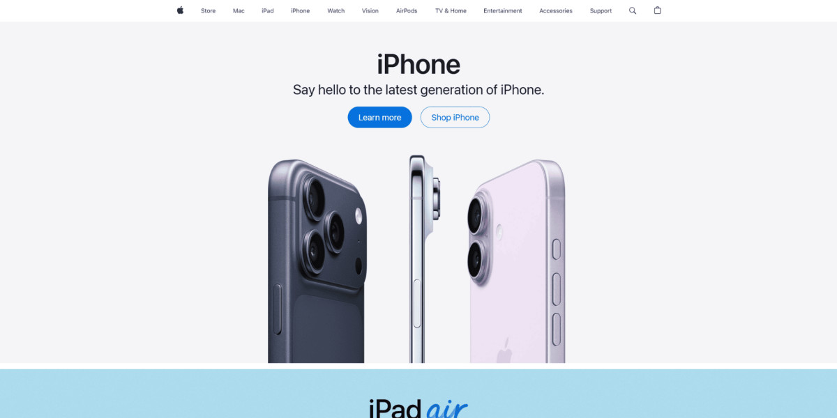
Apple uses simplicity and whitespace to guide attention. Each section focuses on one idea only.
Tesla

Tesla removes almost everything except the product. It is a strong example of focus.
Clean SaaS Website Design Examples
Figma
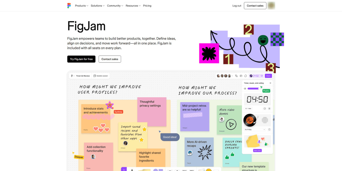
Figma uses clean grids and spacing to handle complex content.
Webflow
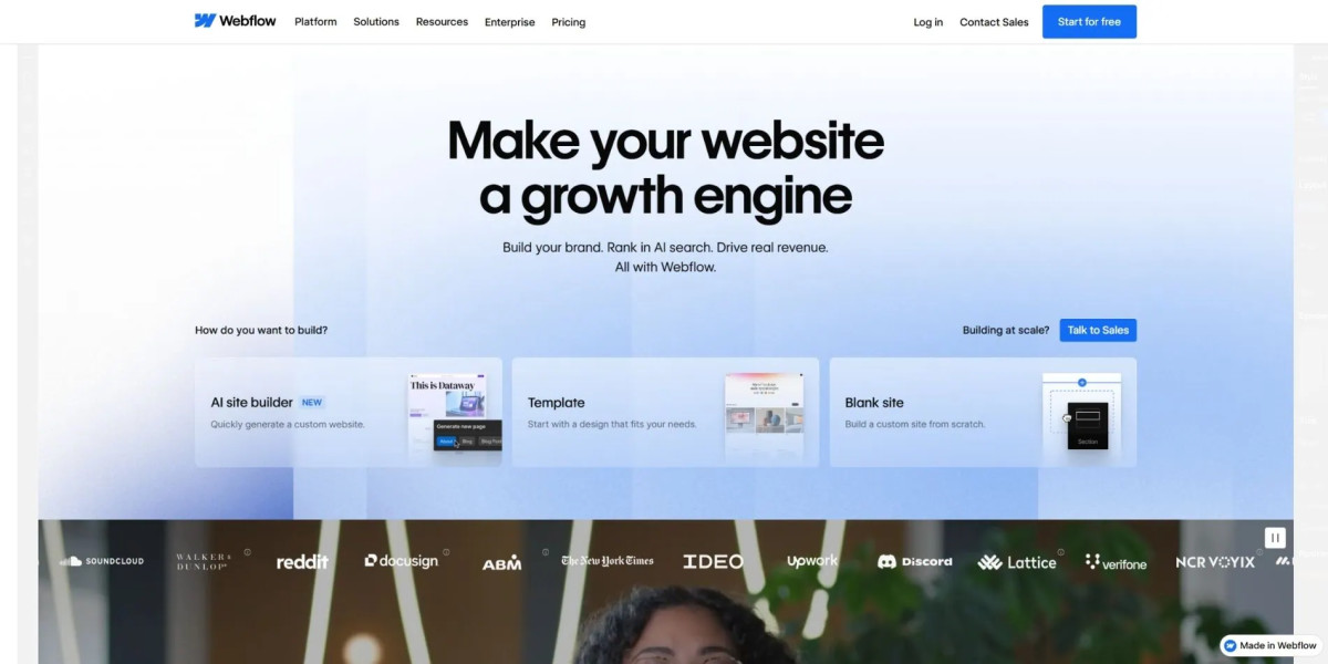
Webflow keeps structure tight despite showing many features.
Clean Ecommerce Website Design Examples
Allbirds

Allbirds simplifies product pages so users focus on buying, not browsing endlessly.
Aesop
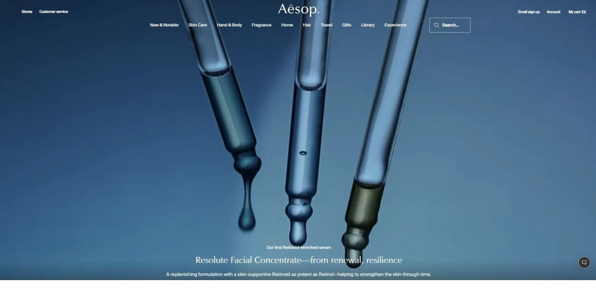
Aesop uses typography and restraint to create a premium feel.
Clean Agency Website Design Examples
Radiant

Radiant uses strong typography, controlled spacing, and a restrained layout to create a premium feel without overwhelming the visitor.
Fostr
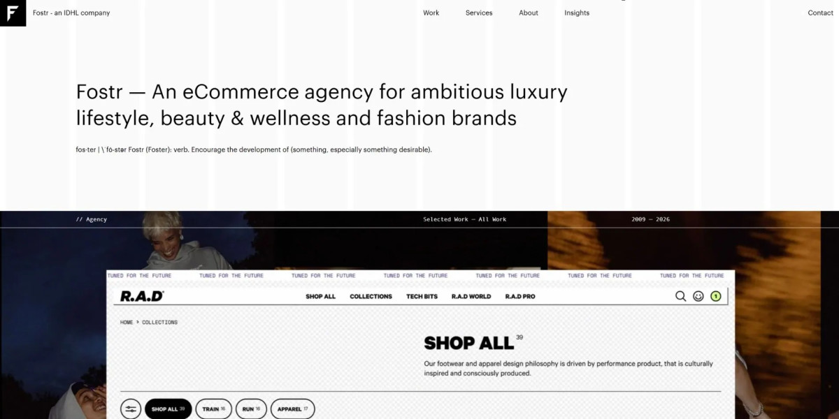
Fostr combines minimalist structure with bold brand presentation, creating a clean agency website that still feels fashion-forward and high-end.
Clean Blog & Content Website Design Examples
Medium
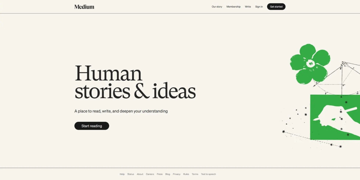
Medium removes everything that interrupts reading.
Substack
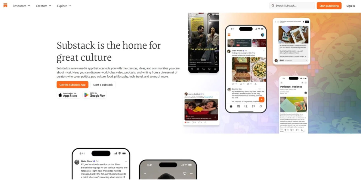
Substack focuses on content first, design second.
How to Design a Clean Website (Step-by-Step Guide)
Designing a clean website means removing noise before adding polish.
Step 1: Define one primary goal per page
Every page should answer one question or drive one action.
Step 2: Map content hierarchy
Decide what users should see first, then structure everything around it.
Step 3: Remove unnecessary sections
If a section does not support the goal, delete it.
Step 4: Simplify navigation
Reduce options to what users actually need.
Step 5: Standardise spacing and layout
Use consistent margins and grids.
Step 6: Refine typography and contrast
Make content easy to read across devices.
💡If you hesitate whether to include something, remove it first. Add it back only if needed.
Clean Website Design Best Practices
Clean design becomes sustainable when it is built into your system, not treated as a one-time effort.
Use a design system for consistency
Limit homepage sections
Keep navigation predictable
Use whitespace intentionally
Prioritise mobile experience
Avoid decorative elements without purpose
A practical benchmark:
| Element | Clean Standard |
|---|---|
| Homepage sections | 5–7 max |
| Navigation items | 5–6 primary |
| Fonts | 1–2 families |
| Colours | 2–4 main colours |
Clean Website Design for SEO and Conversions
Clean website design improves SEO and conversions by making content easier to access, understand, and interact with.
Search engines favour:
Clear structure
Fast loading pages
Logical hierarchy
Users respond to:
Faster decision-making
Less friction
Clear calls to action
How to Create a Clean Website That Actually Works
Clean design is not about removing things until the page looks nice. It is about removing everything that slows the user down.
If you want to improve your website today:
Look at your homepage and remove one unnecessary section
Simplify your navigation by one item
Make your main action more obvious
Improve the readability of your text
Small changes compound quickly. Most websites do not need a redesign - they need restraint.
That is where clean design begins.


