
Key Takeaways
Hero sections shape first impressions more than almost any other part of a website.
The best hero sections prioritise clarity before creativity.
Different hero section styles work for different business models and traffic intent.
Strong headlines and focused CTAs consistently outperform cluttered layouts.
Product visuals, motion, typography, and layout should reinforce the message, not compete with it.
Mobile optimisation matters just as much as desktop aesthetics.
Most underperforming hero sections fail because they try to communicate too many things at once.
Testing headlines, CTA placement, visuals, and layout often improves conversions faster than a full redesign.
What Is a Website Hero Section?
A website hero section is the prominent area at the top of a webpage that communicates the core value proposition and guides visitors toward a primary action.
But the important part is not the layout itself – it is the framing.
The hero section sets expectations for everything below it. If the message feels vague, users become cautious. If it feels clear and intentional, the rest of the page becomes easier to trust.
That is why hero sections influence:
bounce rate
engagement
conversion rate
scroll depth
perceived brand quality
They also shape SEO performance indirectly. Your hero section often contains the H1, primary messaging, and the first contextual signals users and search engines encounter. A confusing or slow-loading hero can increase bounce rates and weaken engagement signals long before visitors reach the rest of the page.
The best hero sections answer three questions immediately:
| Question | What the visitor is really asking |
|---|---|
| What is this? | “Am I in the right place?” |
| Is this for me? | “Does this solve my problem?” |
| What should I do next? | “Where do I go from here?” |
This is why high-performing ecommerce brands invest heavily in strategic website design services rather than treating design as purely visual decoration. Strong website design combines messaging, UX, conversion psychology, and branding into a cohesive first impression that guides visitors toward action.
12 Best Website Hero Section Design Examples
Different hero section styles solve different problems.
Some focus on emotion. Some drive immediate conversions. Others build trust through product clarity or typography. The best hero sections are strategically aligned with what the business actually needs the visitor to do.
Hero Sections with Static Images
Static-image hero sections work best when the visual itself communicates quality, positioning, or emotion clearly.
Apple
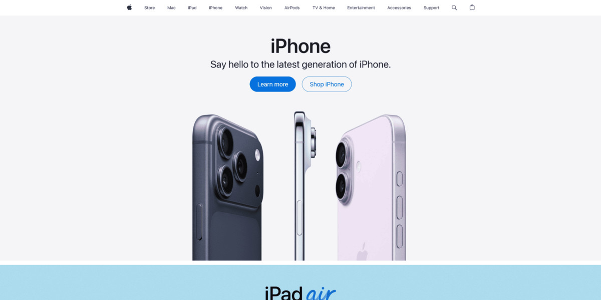
Headline: Minimal, product-focused, and extremely restrained. Apple relies on brand confidence instead of persuasive copy.
Subheadline: Simple feature or launch positioning with almost no filler language.
CTAs:
Learn more
Shop
Classic education-versus-purchase structure with very low friction.
Visual: Large product imagery on clean backgrounds. The product becomes the entire experience.
Why It Works:
Strong focus with zero visual clutter
Premium perception through restraint
Product-first storytelling
Immediate clarity without overwhelming the visitor
Allbirds
Headline: Simple and benefit-oriented. Focused more on lifestyle and comfort than technical product details.
Subheadline: Supports the sustainability angle without sounding overly corporate.
CTAs:
Shop Men
Shop Women
Direct category-based conversion paths.
Visual: Soft lifestyle photography with muted tones and generous whitespace.
Why It Works:
Calm visual atmosphere reduces cognitive load
Clear product discovery paths
Consistent branding and typography
Strong emotional positioning
Motion or Video Hero Sections
Motion-based hero sections help products feel immersive and dynamic when movement supports the message.
Shopify

Headline: Aspirational and growth-oriented. Shopify speaks to ambition more than software.
Subheadline: Clear business outcome messaging in accessible language.
CTAs:
Start for free
Very low-friction entry points.
Visual: Rotating entrepreneur-focused video backgrounds showing real people building businesses.
Why It Works:
Sells identity and aspiration
Motion feels purposeful, not decorative
Emotional storytelling strengthens connection
Keeps energy high without becoming distracting
Tesla
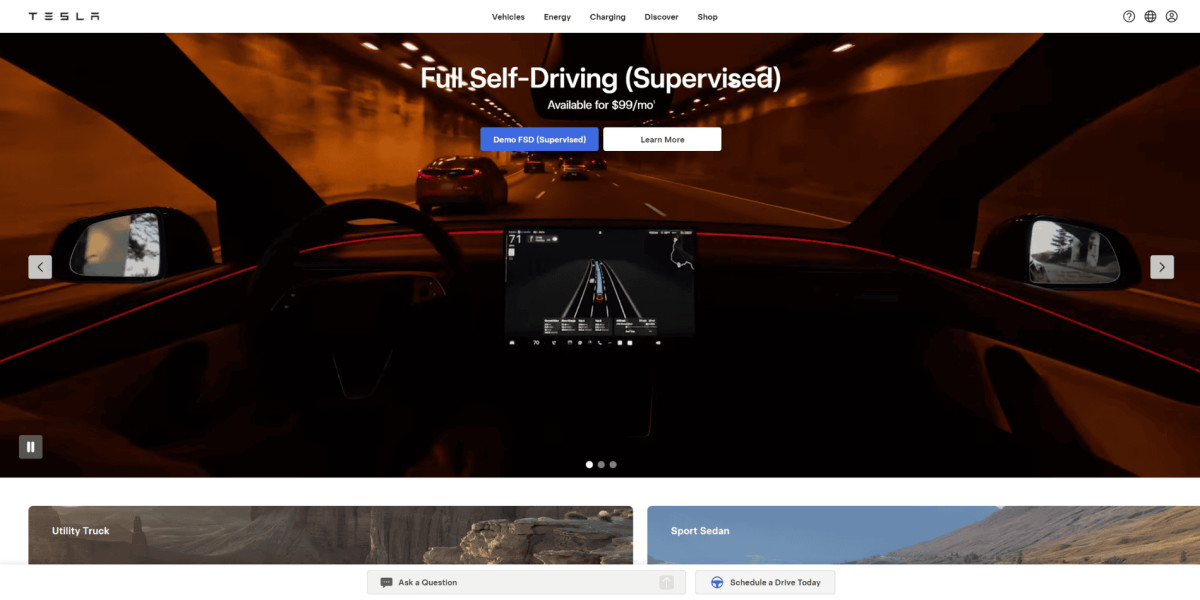
Headline: Feature-led and bold. Immediately communicates innovation.
Subheadline: Pricing or capability-focused supporting text reduces ambiguity.
CTAs:
Demo FSD
Learn more
Clear action-oriented pathways.
Visual: Immersive cinematic driving footage instead of static product shots.
Why It Works:
Demonstrates capability visually
Creates emotional momentum immediately
Strong product confidence
Motion reinforces premium positioning
Minimalist Hero Sections
Minimalist hero sections remove distractions and rely heavily on hierarchy, typography, and spacing.
Stripe
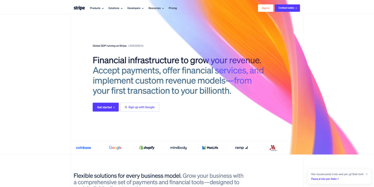
Headline: Direct category positioning with ambitious but clear language.
Subheadline: Balances technical depth with business outcomes.
CTAs:
Get started
Contact sales
Simple onboarding structure for different buyer types.
Visual: Abstract gradients and refined motion rather than literal product screenshots.
Why It Works:
Premium technical aesthetic
Exceptional spacing and hierarchy
Feels sophisticated without complexity
Clear positioning immediately
Aesop
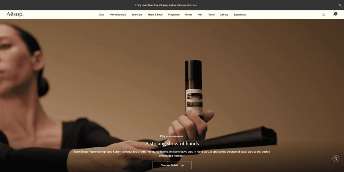
Headline: Editorial and understated rather than aggressively sales-focused.
Subheadline: Supports the premium positioning with restrained language.
CTAs:
Discover
Soft conversion approach aligned with luxury branding.
Visual: Muted photography and elegant typography dominate the experience.
Why It Works:
Creates calm premium atmosphere
Uses restraint as a branding tool
Strong typography consistency
Feels curated rather than commercial
Product-Focused Hero Sections
Product-led hero sections work best when the product itself is visually compelling.
Nike
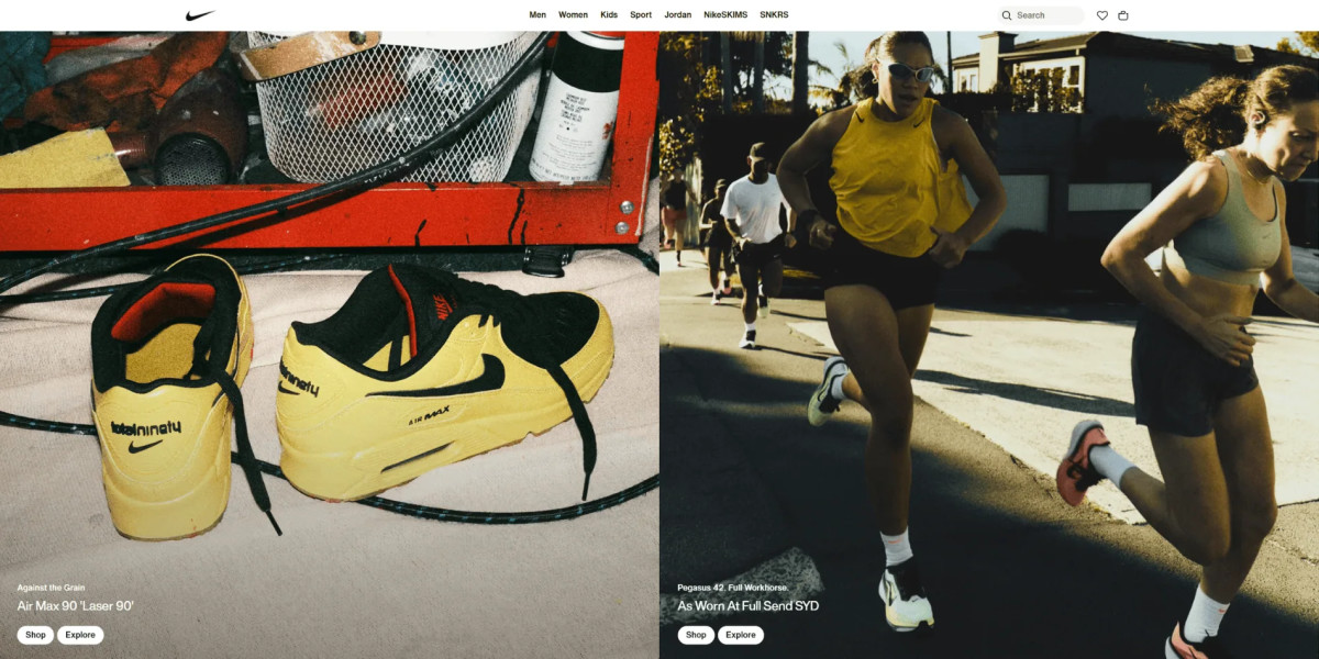
Headline: Emotion-driven with performance undertones.
Subheadline: Minimal supporting copy keeps focus on the product.
CTAs:
Shop
Explore
Simple commerce-oriented actions.
Visual: Large footwear photography with dynamic athletic energy.
Why It Works:
Immediate product focus
Strong emotional tone
Clear commerce intent
Visuals create movement even when static
Dyson
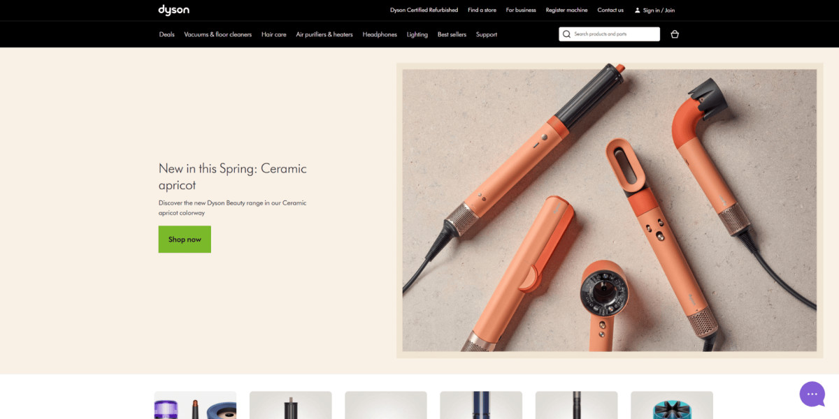
Headline: Performance-oriented and technical without becoming overwhelming.
Subheadline: Supports product differentiation clearly.
CTAs:
Shop now
Balanced purchase and education structure.
Visual: Precision-focused product renders and engineering details.
Why It Works:
Strong product authority
Premium engineering feel
Clean technical storytelling
Excellent visual hierarchy
Split-Screen Hero Sections
Split-screen layouts balance messaging with visual proof efficiently.
Figma
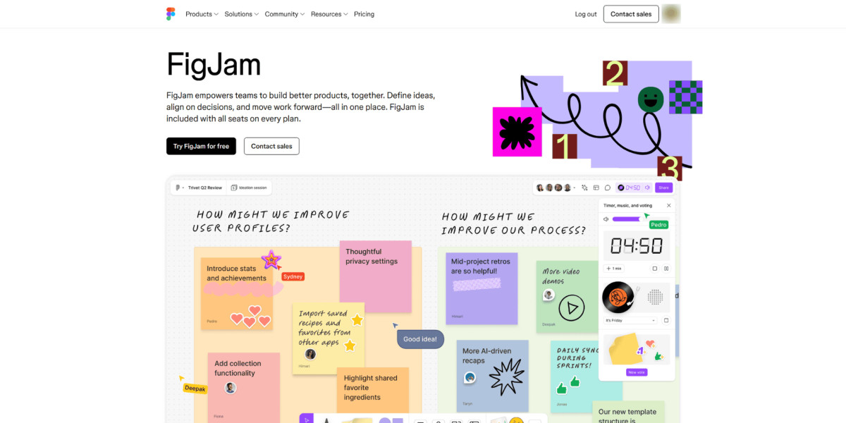
Headline: Action-oriented and collaborative.
Subheadline: Explains the workflow clearly without excessive detail.
CTAs:
Try for free
Contact sales
Supports both self-serve and enterprise users.
Visual: Live-feeling collaborative design previews with movement.
Why It Works:
Product shown immediately
Creative energy matches audience
Strong balance between clarity and motion
Clear user segmentation
Notion
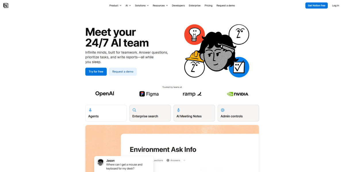
Headline: Short, curiosity-driven, and memorable. It humanises AI before explaining it.
Subheadline: Clarifies the metaphor immediately by explaining AI agents working 24/7.
CTAs:
Try for free
Request a demo
Smart dual-intent structure covering different buyer types.
Visual: Product UI preview with subtle animated elements.
Why It Works:
Strong balance between emotion and clarity
Product shown immediately
Multiple conversion paths without clutter
Reinforced credibility with trust signals
Typography-Driven Hero Sections
Typography-driven hero sections rely more on copy and hierarchy than visuals.
Linear
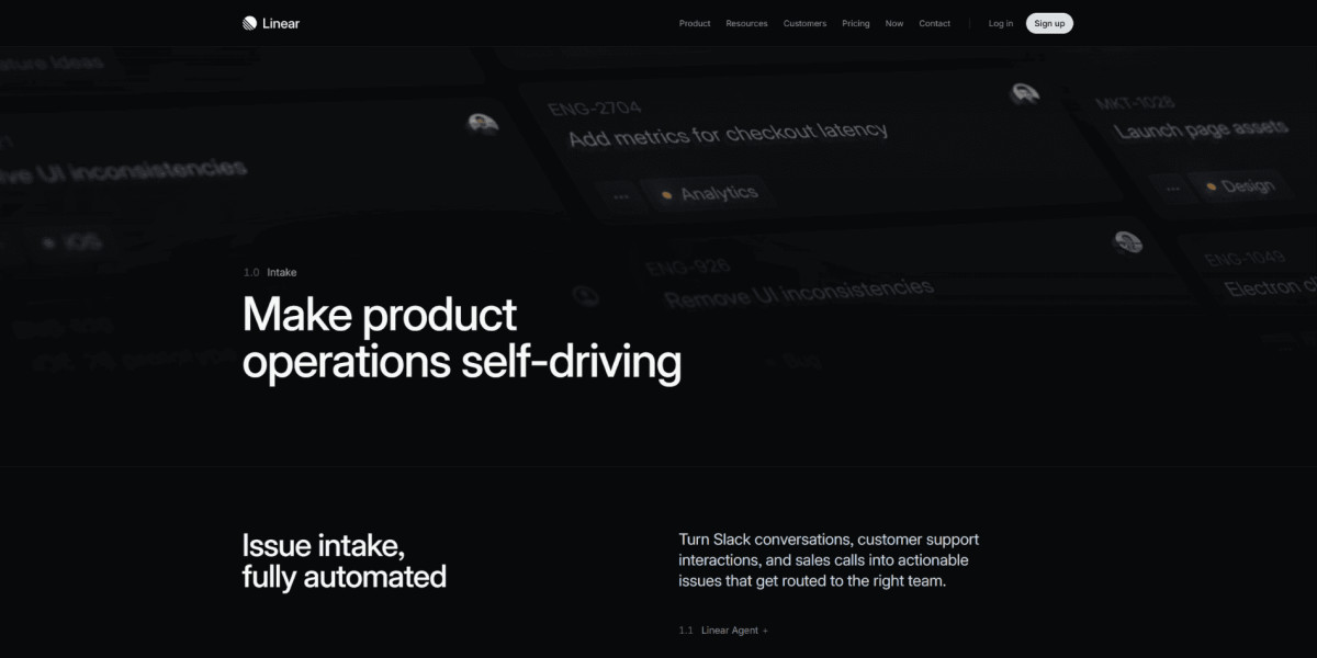
Headline: Highly concise and product-focused.
Subheadline: Technical but still approachable.
CTAs:
View demo
Clear product exploration flow.
Visual: Minimal interface with typography carrying most of the weight.
Why It Works:
Extremely clean hierarchy
Feels modern and premium
Strong developer-focused positioning
Excellent use of whitespace
Medium
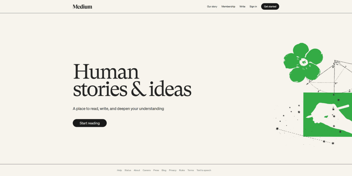
Headline: Editorial and emotionally resonant.
Subheadline: Focused entirely on reading value.
CTAs:
Start reading
Visual: Minimal illustration and typography-first structure.
Why It Works:
Reading-first design
Strong editorial feel
Low visual noise
Clear emotional positioning
Hero Section Design Best Practices
The best hero sections feel simple because difficult decisions were already made behind the scenes.
| Element | Recommended Range |
|---|---|
| Primary CTA count | 1 |
| Headline length | 6 to 14 words |
| Supporting text | 1 to 3 lines |
| Navigation items | 5 to 7 max |
Some practical guidelines:
Write the headline before designing the layout
Remove one unnecessary element before adding another
Avoid homepage sliders unless data proves they help
Use visuals that support understanding, not decoration
Prioritise mobile readability and CTA visibility
Your Hero Section Design Decides Whether People Keep Going
Most websites do not lose conversions because of catastrophic problems. They lose them through small moments of hesitation.
The hero section is usually the first one.
If you want to improve your website without redesigning everything:
rewrite your headline more clearly
remove one unnecessary CTA
simplify your top section
make the next step easier to notice
test your hero properly on mobile
Those changes often improve performance more than adding another feature ever will.


