What is a Landing Page?
A landing page is a standalone page on a website designed for people to arrive at ('land on') and take a specific action.
How to Create a Landing Page on Shopify: Step-by-Step Breakdown
Here's a step-by-step breakdown to creating a strong landing page that will convert:
1. Know Your Goal
First, clarify the purpose of your landing page. Is it to:
Promote a product?
Capture emails?
Announce a sale or event?
Introduce a new collection?
2. Understand Your Target Audience
Who are they?
What are their pain points?
What motivates them to buy?
3. Core Elements of a High-Converting Ecommerce Landing Page
a. A Strong, Clear Headline
Your headline should immediately communicate value.
For example: “Glowing Skin in 7 Days - Guaranteed.”
b. A Subheadline That Adds Context
Explain your offer a bit more.
Example: “Our all-natural vitamin C serum reduces dark spots and hydrates, without irritation.”
c. Include High-Quality Images or Video
If the purpose of the page is to sell a product, visuals should show it in action, using different angles, showing it in context via lifestyle imagery, the ability to zoom in etc.
Consider:
3D views
Product demos
User-generated content like reviews or posts from social media feeds
d. Make Sure There’s A Clear Call-to-Action (CTA)
Make it obvious what action you want your visitor to take. Keep buttons bold, high contrast, and action-oriented.
Examples of this could be
“Shop Now”
“Get Yours Today”
“Subscribe Now for 10% Off”
“Try It Risk-Free”
e. Highlight Key Benefits or Value Propositions
Use icons or bullet points to highlight benefits quickly, for example:
✨ Brightens skin tone in 7 days
🌿 100% vegan & cruelty-free
🧪 Dermatologist-tested
f. Use Social Proof & Trust Signals
Show that others love your product. Social proof is a psychological phenomenon where people look to the actions and behaviours of others to guide their own decisions, especially in situations of uncertainty. It's a form of validation that suggests if other people like or use a product or service, it must be good or the right choice.
Examples of social proof on Shopify stores include customer reviews, testimonials, social media followers, and endorsements from friends or influencers.
g. Create a Sense of Urgency or Scarcity
Encourage immediate action with limited-time offers or low-stock alerts.
Phrases like “Only 17 left in stock!” or “Sale ends at midnight!” work well here. Make sure what you’re saying is factual though - in July 2025, France's antitrust agency said it had fined China-founded fast-fashion retailer Shein 40 million euros ($47.17 million) for alleged deceptive business practices including misleading discounts.
h. Guarantee or Risk Reduction
Make people feel safe about buying. It can help push the purchase over the line if they feel they have a safety net, for example a 30 day money back guarantee or a free returns policy.
4. Optimise for Mobile
Most users will be browsing on their phone so check your page works well on mobile devices. Make sure your page:
Loads fast
Has easy-to-tap buttons
Avoids clutter
Keeps key info at the top of the page so users can read it without scrolling
5. Keep It Focused: One Goal, One Page
You don’t want visitors to feel trapped so it’s a good idea to give them an ‘out’ if they want to go to your main website, but the objective is to keep them on this page until they complete the desired action, so don’t confuse the purpose of the page or give visitors lots of options.
6. Test and Iterate
Use A/B testing to experiment with:
Different headlines
CTA button colour/text/positioning
Product photos
Layouts
There are A/B testing apps available in the Shopify app store that can help you make iterative improvements in all these areas, for better results.
A successful landing page requires constantly testing new ideas, keeping an eye on the data, and adapting to whatever resonates with your target audience.
Shopify Landing Page Examples
a. HelloFresh
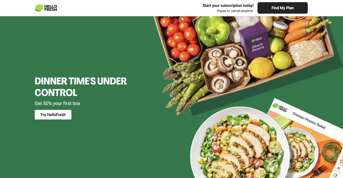
What’s Working Well
1. Clear Value Proposition
Headline: “DINNER TIME'S UNDER CONTROL” is bold and attention-grabbing.
Subheadline: “Get 50% your first box” immediately offers a compelling benefit.
CTA (Call to Action): “Try HelloFresh” is clear, actionable, and button-based.
2. Strong Visual Hierarchy
The page is divided into two balanced sections:
Left: Messaging and CTA
Right: Visually appealing food imagery and fresh ingredients
Great use of contrast: White text on a solid green background ensures readability.
3. Appetising, High-Quality Imagery
The food photography is vibrant and inviting.
The inclusion of fresh ingredients reinforces freshness and quality.
4. Top Bar CTA Reinforcement
“Find My Plan” in the top-right corner provides a second, visible CTA.
Small reassuring message: “Pause or cancel anytime.” This reduces friction for new users.
5. Branding
The HelloFresh logo and product colours are consistent.
Use of green evokes freshness and health.
Areas for Improvement
1. Small Copy Issues
Missing word: The phrase “Get 50% your first box” is missing a preposition. It should be:
“Get 50% off your first box.”
This typo could reduce trust or perceived polish.
2. Secondary Messaging Could Be Enhanced
The tagline “Dinner time's under control” is catchy, but it’s vague. They might consider:
Adding a supporting benefit, like: “Easy recipes. Fresh ingredients. Delivered weekly.”
Or slightly rephrasing to include user pain point relief (e.g., “No planning. No shopping. Just cooking.”)
3. No Social Proof or Trust Elements
At this fold, there are no customer reviews, testimonials, or trust badges.
Including “4.8 stars from 10,000+ customers” or “#1 Meal Kit” could increase confidence.
b. Jones Road Beauty - Quiz Landing Page
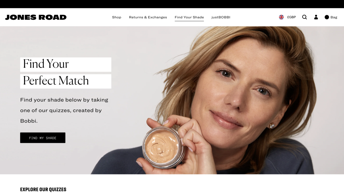
What’s Working Well
1. Clear Purpose & Focus
The page is very focused: its goal is to get visitors to take a quiz to find their shade / product match. The heading “FIND YOUR PERFECT MATCH” + subheading “Find your shade below by taking one of our quizzes…” makes the purpose obvious.
2. Multiple Quiz Options / Tailored Paths
They offer several quizzes (Miracle Balm, Just Enough Tinted Moisturiser, What The Foundation, Face Pencil & Neutraliser, etc.) so that customers can pick the quiz relevant to their needs.
This allows segmentation and more personalised experience.
3. Product Descriptions & Education Embedded
Under each quiz, there is a short description of the product (“Meet Miracle Balm — a light‑reflecting balm …”) which helps educate users before they dive in.
This is good because it decreases friction — people know what the quiz is about.
4. Fallback / Alternative Option
There is a “Still need help?” section offering an alternative: take a selfie and get matched by makeup artists.
This is smart for users hesitant to trust an algorithm or quiz entirely.
5. Navigation & Brand Visibility
The page keeps the brand header, search, shop menu, etc., which is good — users can still explore or trust the site is part of the larger brand.
6. Lead Capture Integration
There is a subscription form (e.g. “Sign up for free shipping on orders over $85” / email capture) built into the page.
7. Quiz Strategy Built Into Business Model
It’s clear that Jones Road uses these quizzes as a core part of their marketing and personalisation strategy. They reportedly achieved strong results (conversions, lead capture) via these quizzes.
That indicates their funnel logic around the landing page is likely solid behind the scenes.
Weaknesses & Areas to Improve
1. Above-the-Fold Clarity and Urgency
The call to action early (“TAKE A QUIZ”) is generic; it might benefit from stronger urgency or benefit copy (e.g. “Find your perfect shade now”).
The page header / hero area doesn’t strongly state why this quiz is valuable (what’s in it for me?). There’s room to reinforce benefits (“no guesswork”, “personalized match”, “unlock your exact shade”).
2. Visual Hierarchy & Emphasis
Because there are multiple quizzes listed, there’s a risk of choice overload. The page could emphasize a “primary quiz” or default recommended quiz for first-time users.
Some quizzes might be more relevant to typical users — highlighting or spotlighting one helps guide users.
3. Social Proof & Trust Signals Missing / Weak
A lack of strong social proof elements (e.g. “XXX people matched their shade today”, customer testimonials, reviews) in the screenshot or source.
Given cosmetics is high-risk (users want assurance), adding user quotes or ratings could boost confidence.
4. CTA Buttons / Visual Contrast
The “Take the … Quiz” CTAs could have their visual contrast or prominence improved. They must stand out and feel clickable.
Ensuring hover states, clear affordance, and consistent placement is critical.
5. Scannability and Layout
The page is fairly long (multiple quiz options). If users don’t scroll, they might miss some options.
For mobile especially, the layout should prioritize which quizzes appear first, possibly collapse “less relevant” ones, or use accordions.
6. Backups for Low Confidence or Drop-off
The selfie matching is good, but consider alternative engagement options earlier (e.g. “Not sure? Start with one quick question first” or “Take a shorter quiz”).
Add micro-commitments: e.g. “Just answer 2 quick questions to start” to reduce friction.
7. Messaging / Copy Polishing
Some product descriptions use idealised / vague language (“melt into skin”, “fresh glow”) which is standard in beauty, but layering with more concrete benefits or results may help (e.g. “shade matched to your undertone — no returns needed”).
Ensure consistency in tone, and always tie back to “benefit to user”.
c. Olipop
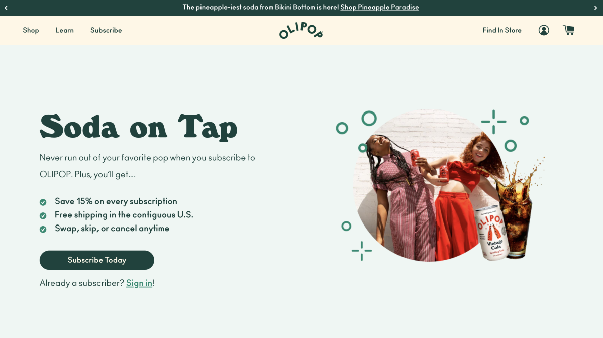
What’s Working Well
1. Clear Value Propositions Up Front
The hero section states benefits clearly:
“15% off on every subscription order”
“Free shipping in the contiguous U.S.”
“Swap, skip, or cancel anytime”
These are strong incentives and reduce friction for signing up.
“Soda on Tap” Framing
The phrase “Never run out of your favourite pop when you subscribe to OLIPOP” helps position the subscription as a convenience, not just a discount.
2. Multiple Products / Flavour Options Displayed
The page shows a range of flavors and pack options (“Classic Soda Variety Pack”, “Fruity Fun Variety Pack”, “Peaches & Cream”, etc.). This gives users choice and appeals to different tastes.
3. Supportive FAQ / Reassurance Content
Below the hero and product offers, the FAQ section addresses key questions:
Delivery timing
Subscriber perks
Payment options
Whether to subscribe even without prior experience
This helps reduce hesitation and objections.
4. Trust & Product Attributes Highlighted
The page mentions product strengths like “Prebiotics,” “2–5g of sugar,” “Vegan,” “Gluten Free,” etc. These help reinforce quality and differentiation.
“Already a subscriber? Sign in!”
Including this is smart — returning users can jump straight to their account, rather than being forced through the signup again.
Areas for Improvement & Risks
1. Hero Section Could Be More Persuasive / Emotive
The benefits are communicated well, but the emotional or experiential hook is somewhat light. For example, it doesn’t immediately connect to the feeling of delight, health benefit, or daily ritual.
Suggestion: add a one-liner above or below the hero that ties into mood, lifestyle, or long-term benefit. E.g. “Sparkle your day with gut-friendly soda — without the sugar crash.”
2. Overwhelming Options / Choice Overload
With many flavour and pack options shown up front, users might feel overwhelmed. Some may hesitate, not knowing which to pick first.
To mitigate this:
Highlight a “recommended flavour pack” for new users (e.g. “Best for starters: Classic Variety Pack”)
Use a default selection or a “most popular” badge
Use progressive disclosure (show a few options first, “see more” for the rest)
3. CTA Button Prominence / Contrast
It’s not always obvious what the primary action is in some of the imagery blurbs (depending on screen size). The “Subscribe Now” or “Subscribe Today” button needs to pop visually, especially on mobile.
Also, ensure the CTA is sticky or readily available as users scroll, so they aren’t forced to scroll back up.
4. Social Proof & Reviews Are Sparse
While there is a quote in the FAQ (e.g. "I’ve been drinking Olipop for a few months …”), more user testimonials, ratings, or before/after stories could strengthen trust.
Idea: add a rotating reviews slider, or real customer photos & blurbs near the hero or mid-page.
5. Clarify Terms: Shipping / Delivery Timing
The FAQ mentions “Delivery dates vary depending on your location” and “you’ll receive an email with tracking”
Users like certainty. Consider giving more specific ranges (e.g. “3–5 business days”) or map-based delivery estimates.
6. Mobile / Layout Considerations
On mobile, make sure flavor images and CTA buttons don’t get lost or shrunk.
Use collapsible FAQ sections so users don’t get lost in content.
Ensure images load fast and scale properly.
7. Objection Handling / Risk Reversal
The page does well with “skip or cancel anytime,” but could be strengthened with:
A “satisfaction guarantee” or money-back offer (if they don’t like it)
A first-box trial / lower-risk entry (e.g. “Test one can for X price”)
Visual cues that highlight “no hidden fees” or “no surprises”
Create Great Landing Page For Your Shopify Store with Radiant
If you need help with your Shopify store, whether it’s designing and developing a new landing page, or working strategically to help you improve your store’s customer experience for more sales, get in touch with the team. We’d love to have a chat to see if we can help you improve your brand’s results.
Take a look at some of the tactics we deployed to help BOL Foods and Bird and Blend Tea Co. improve their ecommerce results!