What Makes for Good Product Photography?
- E-Commerce
- Design
- 1 Min

Key Factors in Achieving Stand-Out Product Photography
In the world of online shopping and e-commerce, it's important to ask: what makes online buying so appealing? Consumers enjoy looking through photos of items that are available for purchase because it allows them to envision how their lives would be different if they owned a certain product.
In fact, this photography is so important that product photography can make or break a website, both with regard to the visuals of the website itself and the ability of products to appear desirable enough to sell. It determines if a website looks good, and many marketing professionals note that it’s just as important as the design of the website itself. Today we’ve acquired the help of our photographer, Seth Zworestine, to take a look into what makes good e-commerce photography, why it’s important to have quality product shots, and why updating your photography regularly is vital!
The Elements of Good Product Photography
Many elements contribute to what makes E-Commerce photography objectively good, and some of our main priorities at Radiant are those listed below. Like any other art form or media though, how you engage with photography can be specific to your brand and its visual voice.
Finding Your Brand’s Visual Voice
A visual voice is how a brand or company displays itself visually using images, graphic design, animation, illustrations, ads, and more. Brand photography plays a huge role in defining a brand's visual voice. Seth says, "With so much content out there and even more being added every day, it is important to try and create interesting imagery that speaks to your brand and customer" – and he's right. Each photo on your website is a moment that you're able to communicate far more than the product at hand, and an opportunity to showcase what makes your brand so special. "To have memorable content is a huge plus, although often hard to achieve due to how much content we consume in a day."
Accurate Colour Representation
"There's nothing worse than buying a product that looks one colour online and then is completely different when it arrives," says Seth. We've all fallen into the trap of incorrect product colouration, purchasing something that doesn't quite fit the aesthetic or colour palette we had in mind. The best way to fix this? "Use a grey card to set the correct white balance as well as a colour checker so that in post-production, one has a reference for accurate colour under the specific lighting you used." Grey cards are grey, flat objects created from a flat reflectance spectrum that enable photographers to quickly set the white balance in-camera. They’re absolutely necessary in commercial work, where correctly reproducing the colour of an item online is needed.
Accurate Size Representation
In addition to accurate colour representation is accurate size representation. Your product photography should make sure that the size is discernible, and you especially do not want an item that looks big online but arrives being much smaller. Seth notes that this is one of the biggest advantages of lifestyle pictures because they place your item in a real-world situation that gives consumers a point of reference for the size.
Using a hand or person to display a product is a great way to demonstrate the relative size of a product, and if you're not using a model, staging elements like stuffing and padding should be used to give the item volume and demonstrate its true silhouette. For example, placing a piece of furniture alongside other standard-size living room items like a couch, rug, and coffee table helps potential buyers gauge the true size.
Continuity
When shooting photography of your E-Commerce products, there are a lot of factors that need to be kept constant. The composition and angles of photos should be the same, and ideally there's a constant number of images per product page. This includes products that come in different colours, and there should be the same number of images per product variation. Seth notes, "When products sit next to each other on a website there is a continuity as a whole; there is a uniformity."
Good photography makes it feel as though you’re looking at different angles as you scroll through the multiple images available, and you don’t want there to be inconsistencies in product placement, size, or lighting between consecutive photos of the same item. Studies by Shopify show that only 0.52% of consumers want to see a single product photo, while nearly 60% would prefer a 360-degree view of it – so the more visuals you can provide about a product, the better. Close-ups and zooms are a plus.
Lighting and Exposure
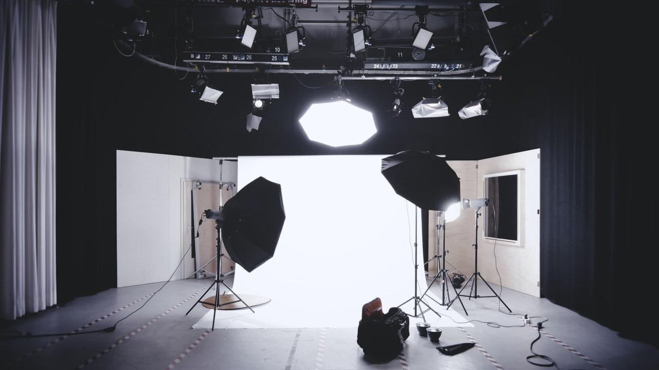
Proper lighting is essential, and can affect how colour and texture of a product appear online. The goal is lighting that doesn’t generate unwanted shadows or discolouration, which comes from quality light sources and white balancing. Sunlight and standard lighting tend to have more "warm" temperatures, while fluorescent and LED lights have cool tones. While some photographers advise against using multiple light sources, Seth instead says, "I may use one or ten lights, or I may use a mixture of natural light (sun) with artificial light. I will always make one light my key light, meaning that it is my primary source. The others may be used to back-light a subject or fill shadows. It is very important to understand how to balance multiple lights as well as potentially mix ambient light/daylight with artificial if you are using more than one or a mixture of them."
Generally speaking, there are two types of lighting styles that utilise either soft light or hard light: high-key and low-key. High-key lighting simply means "bright," and low-key means "dark." High-key lighting is used when photographing a product because it allows a product's visual features to be seen without areas of shadow or darkness.
Lighting and exposure go hand-in-hand, and correct exposure is also vital. When it concerns white or light-coloured products, overexposed surfaces can cause "blow out." Blow out is when the lightest areas clip, causing a loss of digital detail that can't be recovered during post-production editing.
Seth gives an example: "If you were photographing a white T-shirt and overexposed it, you may lose edge detail. This means that in post-production, you probably will not be able to see where the T-shirt begins and the white background ends, as well as not being able to see any texture."
"The general rule of thumb is to get it right in camera, and don't rely on post-production (Photoshop) to save you. It is not very common these days, but a good practice is to use a light meter which gives the correct camera settings to use based on the light intensity."
Well-Styled Products
Styling involves the photographic elements that surround the product you're taking pictures of. Styling is vital to the pleasing aesthetics of an image – "hence why there are professional stylists," says Seth.
Many photographers opt for more minimalistic backgrounds devoid of crowded visual elements for product photography. Product shots tend to have solid white, grey, or light-coloured backgrounds. Backgrounds should be chosen based on the type of product though. For example, coloured backgrounds tend to be avoided on garments or other wearable items because the contrast can affect how the colour is perceived. However, colourful backgrounds, such as trendy pastels, can add a layer of uniqueness for products where colour isn’t as important, like those that come in bottles.
How a product is styled should speak to its intended audience or demographic, as well as the lifestyle or sensation you hope to produce for the customer. "Styling must enhance the product. It must elevate the product above what the basic intent of use is."
Seth points out that photography is, in itself, a means of styling that uses light and composition to decide what elements are found in the final media product. Good styling involves keeping products clean and in perfect condition, free of wrinkles, fingerprints, and loose fabrics (if a model is used). "It's all smoke and mirrors at the end of the day. Through good styling, someone can make a £10 pair of jeans look like a £100 pair, or a cheap watch look expensive."
Make Use of a Directional Shadow
Lastly, the use of a directional shadow will help ground your product in the shot. You don't want your item to seem or feel like it is floating in mid-air. Using a directional shadow adds a hint of realism to an otherwise staged photo, and makes the product seem more tangible to a potential customer, which increases their likelihood of buying.
Why It’s Important to Have Good Product Photography
You’ve worked hard on your products, and having good photography ensures that the quality shines through. While the copy of product descriptions can be captivating, people generally absorb most of the key features of a product from an image, and at a much faster rate than they would reading. Knowing that so many image search engines are becoming more popular, having photography that shows your products off in a positive light allows more people to find (and purchase!) them.
Seth says, "The number one reason to have good product photography these days is to stand out amongst the millions of companies and brands that are potentially selling the same thing as you. At the end of the day, what makes me want to buy, for example, a T-shirt from your brand, especially if it isn't one of the big ones (Adidas, Nike, North Face, etc.)?"
The stakes are certainly higher without a huge brand name attached, and more work is necessary to get your product into the hands of customers.
"A simple way of increasing those odds is to have great content – whether that is photographic, video, or a mixture of both – that builds a memorable brand, aesthetic, culture, or identity that people want to buy into and be a part of."
Why You Should Keep Your Photography Fresh
There are a few reasons to keep your E-Commerce photography fresh.
One of the biggest reasons for returns is that a given product does not look like its image. Images should never be misleading, and you should critique your product photography from a consumer’s point of view. While you are familiar with your products and therefore can conceptualise their in-person appearance, strangers may not be able to. If you're receiving regular returns on items, especially with reviews stating that an item isn't well portrayed online, it may be time to fix its photographs.
Another reason may be that you've realised something isn’t selling. If you’ve noticed that certain items aren't performing well, maybe it’s time to revisit their photography. What makes them different from the items that are selling best? Sometimes a simple photography facelift can make all the difference.
Some businesses choose to update photos when their company has been around for a while and the quality of product photography hasn't kept up with the digital age. Moreover, newer, higher-quality photos can be found to load faster than older counterparts when formatted correctly, which is essential for keeping an item page's bounce rate low.
Seth gives wise words: "Bad content is easily and quickly forgotten; regular, good content isn't. One should be aiming to create content that (potential) customers want to share."
Radiant’s New Photography Services
At Radiant, we know that stunning photography is essential for the success of an E-Commerce business. From product shots to lifestyle photos, our team – including Seth! – will ensure your products are always showing off their good side. It’s time to get in the limelight; contact Radiant today for our E-Commerce photography and media services including production, direction, social media content, and videos!


